Computerized Art in-touch with technology
|
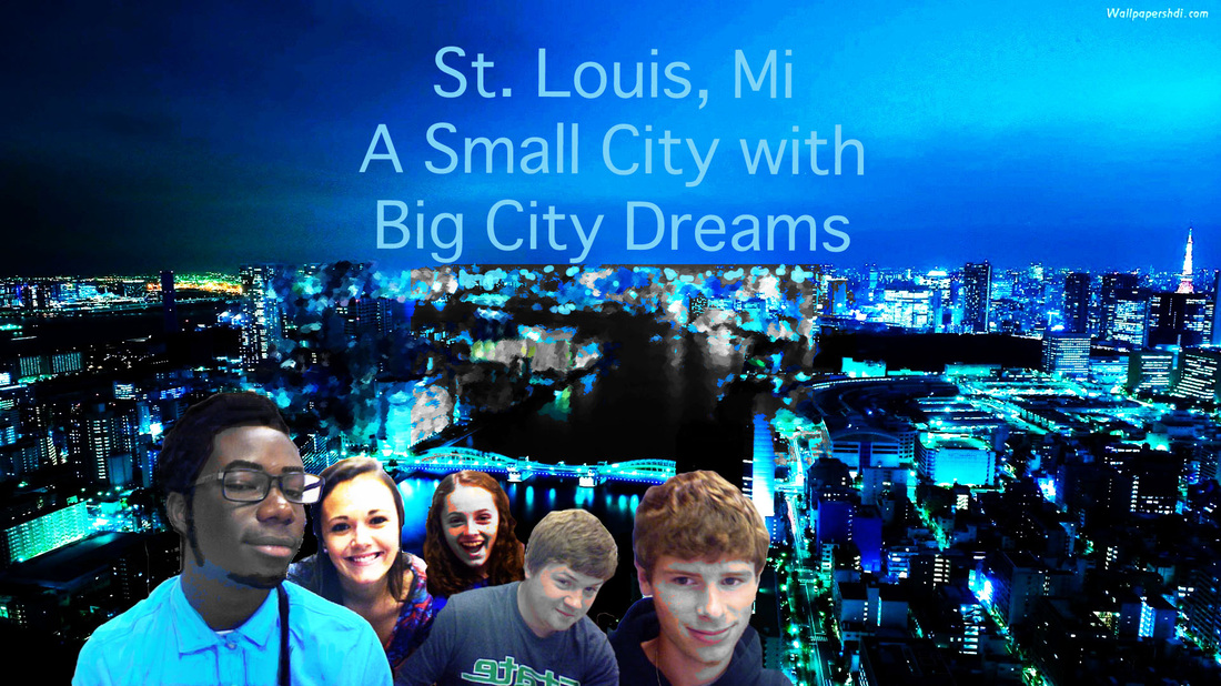
In this art piece I cropped and edited my classmates and I into a city like background. I really like how everything turn out. I brighten up the picture and the highlights and added a little darker tin to the already dark top left corner. One thing I could of improved on this is the brightness of the focal point to add more to the emphasis on a small city with big city dreams.
|
Idiom Art Project: Avatar
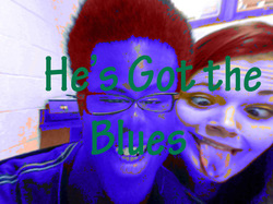
I used the saying He's got the blues and that is ironic because when someone has the blue they are usually sad but in this case this person is just blue. So I use irony to depict a specific idiom. One thing that I could of improved on this piece is maybe making the background a solid color. Maybe pink, to give the blues their balance.
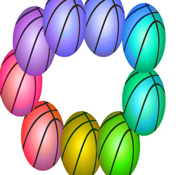
The color wheel shows all the colors on the spectrum wheel. I decided to use an abundance of basketball because it is my favorite sport and because there are many spots and sections of a basketball making it easy to to show the different color schemes.
My Kind of Meal right here. #Hunger
v
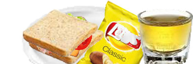
I made myself a turkey sandwich with american cheese, tomatoes and pickles. Also I have a side of lays chips and a glass of apple juice. One thing that I could of did was add more food. My snacks turns out to be a dinner. Eddie Jackson don't play when it comes to food.
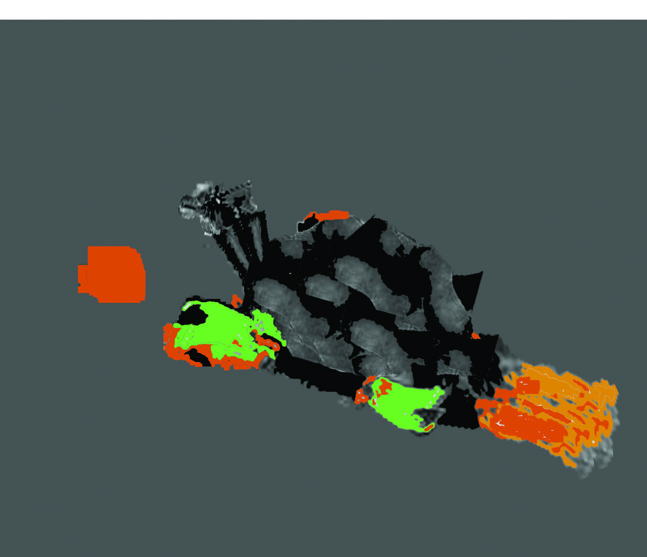
Robot Turtle
|
In this piece I decided to use a turtle and I took everything about the turtle and made it into metal. Because of the background setting the image turned out and looks like its charred and old metal. I got this appearance by error but none of the less this was what I was going for. This mechanical turtle runs on gas and fuel etc. The shell of the turtle is layered metal and the legs of the turtle are robotic and rolls kinda like a car and it has a turbo fuel jet pack in the back.
|
|
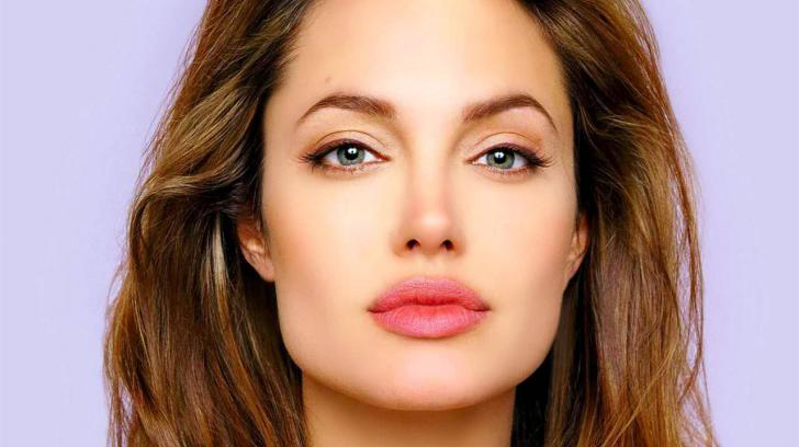
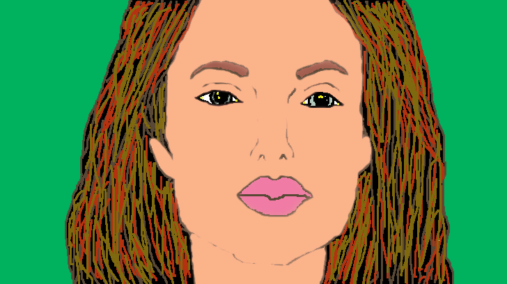
An Individual Drawing In this project we were suppose to pick a person and try to make the exact copy of them using the sketch and paint function on Photoshop. The hardest thing for me to do in this peace was the hair of Angelina Jolie
|
|
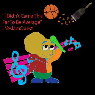
In this project I had to use several objects that reflect me and I choose a basketball and a paint brush because those are activities that I strive to do good in. Also, I placed a quote that I really like that shows my work ethics. I know you may be wondering what that creature looking thing is. He is a peanut person from the proud family and I chose him because when I was young and played little league football I was called peanut by Trokon Jayqua. I admit my head was shaped like a peanut and I grew into it... a little lol and I chose a microphone because and music notes because thats what I do on my spare time. I make rap music and my rap name is Simply Ed. hahaha
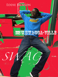
In this piece we were to create our own Advertisement picture. I decided to advertise my swag. It is well need to up your swag once in awhile. The selection of color really attracts the eyes from the jump.

Day 1: Swap a products brand identity
I chose to swap the basketball and the baseball icon patches and place them on a basketball and a bowling ball. It would be weirdly different if you would play each sport the way that it is not usually played.
I chose to swap the basketball and the baseball icon patches and place them on a basketball and a bowling ball. It would be weirdly different if you would play each sport the way that it is not usually played.
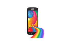
Day 2: A 2D object turned into 3D
I made a road of rainbow look as if it was coming out of a galaxy avant cell phone. The color scheme really made my work easier to accomplish. Also, I really like how the phone was well portioned in size to the rainbow. It gives it more respect and a 3d look.
I made a road of rainbow look as if it was coming out of a galaxy avant cell phone. The color scheme really made my work easier to accomplish. Also, I really like how the phone was well portioned in size to the rainbow. It gives it more respect and a 3d look.
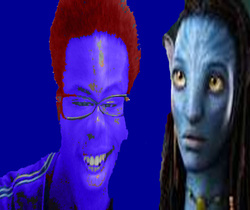
Day 3: An interactive self-portrait with a cartoon
I told myself when I took this picture that I looked like an Avatar. So I was like humm why not do this picture with an avatar chick in here since I kinda look like one. And then this piece came together just okay.
I told myself when I took this picture that I looked like an Avatar. So I was like humm why not do this picture with an avatar chick in here since I kinda look like one. And then this piece came together just okay.
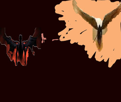
Day 4: Literal interpretations
For the literal interpretation I chose to do good versus evil, the light versus the darkness. Because there is for a fact good that goes on in this world and also bad that goes on too. One thing that I could of did better is making the outline around each character more smooth to give it a professional look. Also, a couple quotes would of definitely helped.
For the literal interpretation I chose to do good versus evil, the light versus the darkness. Because there is for a fact good that goes on in this world and also bad that goes on too. One thing that I could of did better is making the outline around each character more smooth to give it a professional look. Also, a couple quotes would of definitely helped.
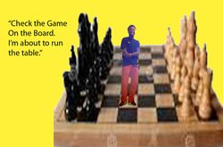
Day 7: Oh no i was shrunk in art class!!!
I think this art piece speaks for itself. Chess is something that I like doing and I decided to engage myself in the board and in a way take control of the game. One thing I could of did better was to put myself more in the center of the chess board so the focal point was more clear.
I think this art piece speaks for itself. Chess is something that I like doing and I decided to engage myself in the board and in a way take control of the game. One thing I could of did better was to put myself more in the center of the chess board so the focal point was more clear.

This is a good way to use text as art and to experiment with different tools such as the brush. I really like how I layered this piece and the font of the under lettering is black so it makes the color scheme complete. This emphasizes more on the word Eddie and allows each letter to be more recognized in their designs as to the wording just being plain.
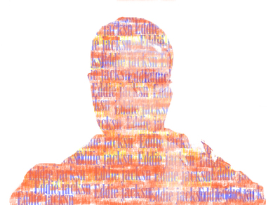
In this piece a picture is said in a thousand words and we did a project of making words into our figure. The hardest thing about this project was the entire project lol, but as I got help every step of the way the picture starts to show up. This was creative because I use this in my music career and the every color correlates to each other.
|
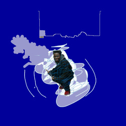
In this project the self portrait is of me. To be honest I'm kind of confused about what happens after high school and I feel like if I'm having a bad day only I can control how I let it affect me. Also I am very creative and if I think hard and put my mind to it I can make my dreams reality. I really like the choice of color scheme in this one. It makes the picture have more style.
|
In this project we created our own advertisement. This is the cover for my rap group and its my little brother, his friends and me that are in this group. So far I have over 50 tracks made, a music video and a fan page. A couple of my songs are online, but not all of them. Some of them were wack bars and only the best of the best are placed online.
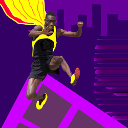
Create yourself as a superhero project was an easy one. I took a picture of me from track and I did some cropping here and there. Then I created a night background for the hero. I added a cape to my hero and I saw that it was kinda plain so I added a bright color to it so that something popped out. Also, with the angles that I chose to draw the buildings made the whole picture seem as if it is popping out of the page.
